
An in-depth examination of the FTSE
Week beginning January 16, 2012
Welcome back! I hope most of you managed some sort of break to refresh the little grey cells for a wild 2012.
Copyright: Randall Ashbourne - 2011-2012
Secondly, I'll need to set up a new Archives section for 2012 which might take a few days, so last weekend's report won't be available immediately. Not that it matters, since it contained no analysis.
However, I did indicate last weekend that since I went into Wall Street in-depth in Forecast 2012, that I would spend more time this year dealing with some other indices - and I intend to begin meeting that promise this weekend by starting with an in-depth examination of the FTSE.
I would hope the heading didn't cause an instant moan among those of you wanting yet another waffle about The Vacuous Troll, Pollyanna. The line at the end of these reports is more than a disclaimer ... these Eye of Ra reports are NOT trading advice, they're intended to reinforce the message of the book: Learn how to do it for yourself - reliably, regularly, consistently, safely, profitably - so you don't have to spend time and money every week or month on expensive newsletters etc.
I will find time towards the end of this week's edition to deal with the ASX200 ... and I might deal briefly with the SP500.
More importantly, in looking at the FTSE in-depth, we will deal with lessons that can be applied to any market, stock, index or commodity.
So, let's get to it.
Before we return to our regular programming, there are some small items of housework.
Firstly, I can see from the site statistics log that most of you have downloaded Forecast 2012. The link will be removed this weekend and, unless you're a new book buyer, you'll have to write and request it.
Firstly, I can see from the site statistics log that most of you have downloaded Forecast 2012. The link will be removed this weekend and, unless you're a new book buyer, you'll have to write and request it.



In Forecast 2012, I spend a great deal of time detailing some of the important discoveries made by other financial astrologers and analysing the significance of those findings to the current situation in world markets.
This weekend we will spend some time dealing with my discoveries - that particular stocks and indices respond over the very long-term to particular planetary price lines ... and that those lines provide consistently reliable price targets for taking profits and watching for trend-turning points.
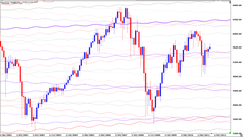
On pages 36 and 37 of Forecast 2012, I reveal the long-range planets for the FTSE are Uranus, Neptune and Pluto, with the index tending to travel to those lines via North Node channels. I showed only the broadest markers - the planetary lines set at 360 degrees.
I mentioned that altering the lines to 180 or 90 degrees - the Opposition and Square aspects in astrological talk - "show consistent markers for shorter timeframes".
And here they are:
Once again I will stress ... it is not necessary for any of you to know anything about The Spooky Stuff to understand these weekly reports and most certainly not necessary to trading profitably!
However, some of us do know a lot more than diddly and some of you are interested in learning more. Okay, so what we have above is the long-range monthly of the FTSE, showing how Uranus, Neptune and Pluto are the long-term Old Gods rulers of this index.
So far this January, the FTSE is backing off from a touch of an overhead Neptune (that's the dotted line from which the last bar is hanging by a thread). Now, I want you to trace that line back in time and especially to how Price reacted the first time it touched it during the recovery rally from the 2009 Low.
And ask yourself: Could that be a technical head-and-shoulders pattern forming with Neptune defining the shoulders?
Also, look at the double-bottom Prices of June, 2010 and August, 2011. Both freefalls stopped at a dotted Neptune. We will come back to that double-bottom in a technical chart later in this edition.
Now, the point of these long-range planetary price charts is to use them in conjunction with Fibonacci Rx and Xt (retracement and extensions) to set targets highly likely to stop rallies dead in their tracks - and also set targets for bottoming bounces.
Regular readers will know I have refined these long-range charts for intermediate trends, using what I call my Weekly Planets Charts.
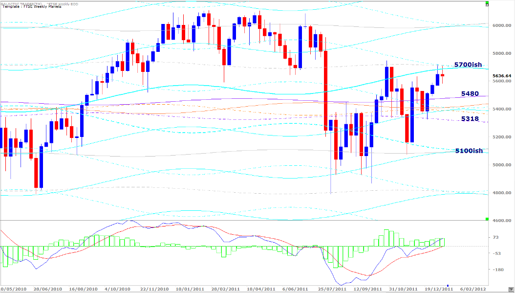
The FTSE Weekly Planets chart allows us to set nearer-term targets. Now, I don't mind when the infidel non-believers wander around their chat rooms dismissing astrology as a load of bollocks. Ignorance usually has a loud mouth. And, in any case, you all know my constant nagging that astrological expectations do NOT override technical conditions.
However, my little book is a strange compilation of all the things I think you really need to know - and none of the stuff you don't need - in order to be able to make your own future. And that's why I want to go through this topic of the FTSE in some depth.
Because, I'd like those of you who are trading the FTSE to spend a LOT of time studying these two charts to know there are certain absolute no-brainer price targets where you should get the hell out of the trade, as well as points where you can seriously consider opening a new trade - in either direction if you're playing both sides.
Once again, backtrace that dotted Neptune line which has stopped the current rally to where it stopped the first spurt up from the August/October Lows; how it underlined Support from 2010 into mid 2011; how it was initially Resistance, which turned into Support and is now Resistance again.
There is an important lesson here, folks, and I know some of you have been missing it by continuing to pay FAR too much attention to short-term jerk-arounds and the overnight manipulations of the various Motherboards.
There are very clear, very reliable Price targets on these charts at which one can open a trade without a high risk of loss ... if you are using loss stops, just in case the trade does go against you. The most important lesson of The Idiot & The Moon is: Always protect your capital.
And with charts like these, that's not a particularly difficult thing to do.
Okay, I've revealed to you something no-one else is going to tell you ... exactly which of the Old Gods control the FTSE and the Price targets which must be watched for any potential trend changes.
Having dealt with some of The Spooky Stuff, we can turn our attention to the technical stuff.
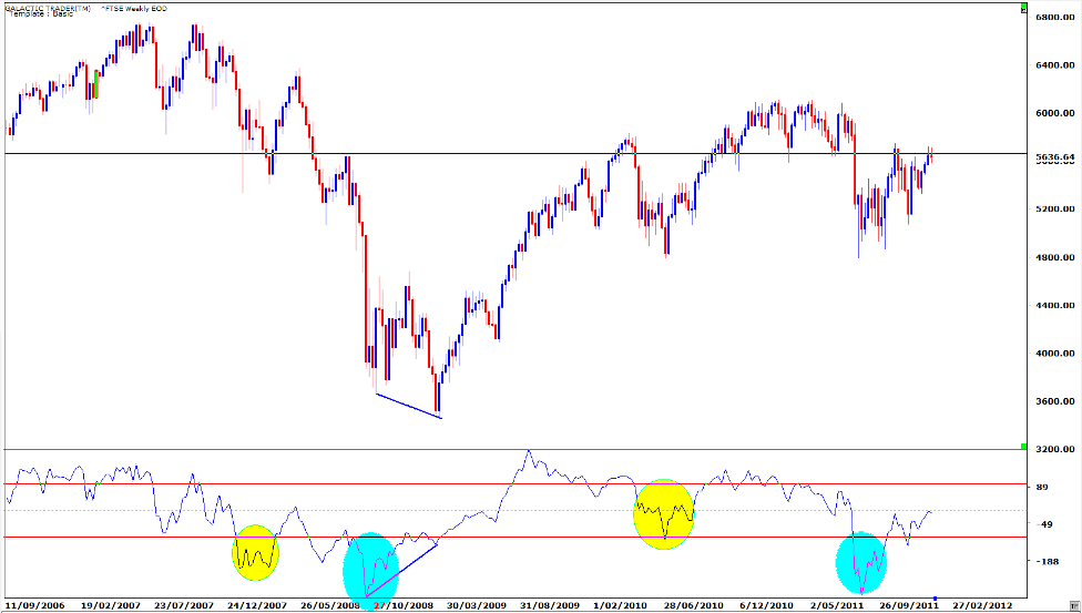
No planetary price lines; we will content ourselves with a simple horizontal line at the price level the index has been unable to close above for the past 2 weeks.
We can see a potential head-and-shoulders pattern forming. Potential, remember. We never get married to our expectations. Now, we want to look at the double-bottom pattern. The first thing to notice and be wary of here is the huge negative divergence in the oscillator, one of the Canaries described in The Technical Section.
While Price dived as low into August/October as it did in June, 2010, the Canary choked and fell off its perch - something it did not do at the Low in 2010.
In fact, the Canary dived to the same level it did in 2008, when Price was much lower than it was in August/October. It is a very loud klaxon going off telling us the air is turning toxic.
This is a dangerous price level to assume anything. There is very slight positive divergence in the current state of the oscillator, in that its current peak is just a tad higher than at the top of the first leg out of the October Low. It is possible the Price might break above that horizontal line we've drawn. But, it's dangerous because the oscillator is at the Zero line and showing a preliminary signal of being rejected, which is a nasty, nasty signal if it holds that way.
So, this is one of those times when we need to be very quick and nimble if we have open positions in the FTSE, regardless of whether we're Long or Short.
At the 2008/2009 Lows, I have marked the divergence between the Price and the Canary's readings ... Price continued to fall, while the Canary started to sing more sweetly.
We need to see exactly that sort of divergence develop before we can be sure the downturn which appears to have started in 2011 is over.
Now, one of the reasons I caution that we cannot assume anything at this level, is shown by the following chart. As y'all know, I have a Bearish expectation for the year ahead and my predictions in that regard are based on both technical readings and Spooky Stuff.
But, it is far too soon to dismiss the alternative Bullish scenario out-of-hand.
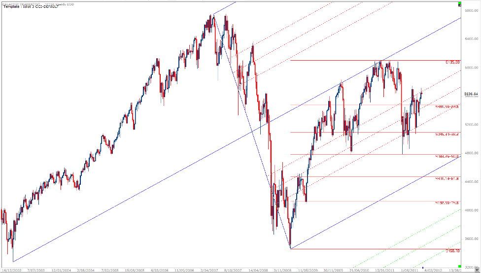
For example, if I use an Andrew's Pitchfork from the 2007 High to the 2009 Low and apply its handle to the 2002 Low ... the FTSE is in a new Bull market, not simply a Bullish recovery phase within a long-running Bear.
The red, dotted diagonals within the blue tynes of the fork are Fibonacci relationships to the tynes and, as y'can see, certainly helped define the closing price lows during both the 2010 plunge and the more recent one.
We can also see how important the Fibonacci Rx levels have been. The full decline, so far, stopped at 50% of the uptrend range ... and while that's a tad deep, it does leave open the distinct possibility of another run to even higher levels.
Now, let's have a brief look at the daily.
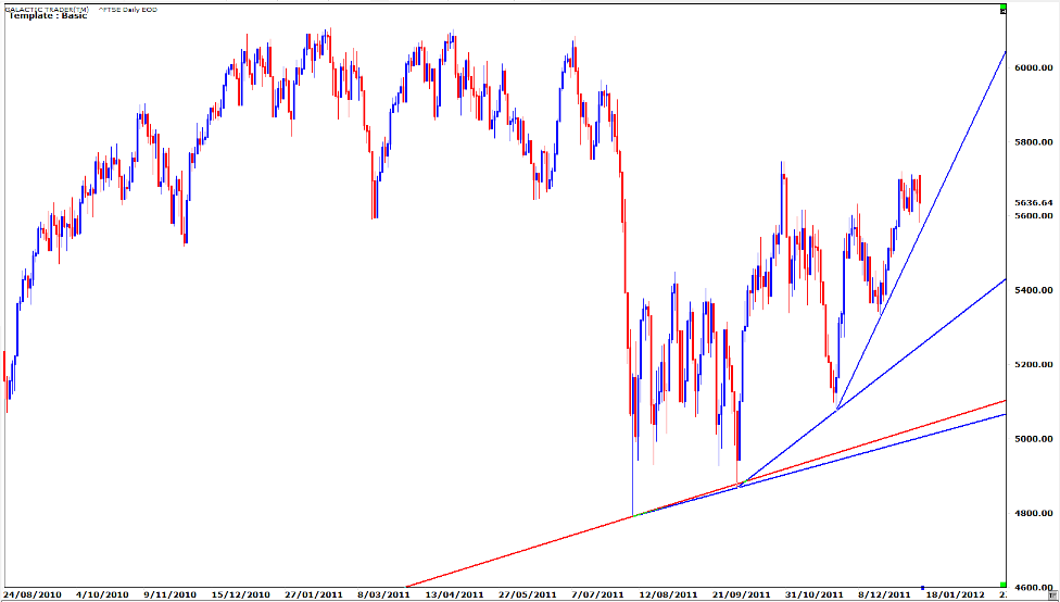
Yahoo has the policy of opening this index at the same price as the previous day's closing price. Which is just bullshit. I've taken the liberty of making the last daily bar according to reality, rather than Yahoo's fantasy.
The computers opened the index at the upper edge of its recent limit - and couldn't hold the selling. But, let's not worry about the way the big boyz are constantly trying to manipulate the FTSE so they can manipulate Pollyanna.
What we're interested in comes straight from one chapter of The Technical Section ... what happens when you have three, rising trendlines, the sharpest of which is at a blow-off angle.
Okay then, let's try putting all of this together.
* We know from the long-range Old Gods and FTSE Weekly Planets charts that there was a difficult hurdle to overcome at the exact Price levels the FTSE has been bumping its head against for the past two weeks.
* Knowing nothing about planets, we could arrive at the same conclusion with a simple horizontal line and Price behaviour over the past 8 days.
* We know there is severe oscillator divergence showing on weekly charts, indicating the intermediate downtrend is very probably not finished.
* And we know from our ability to draw a few lines that the index is riding a blow-off angle which is never sustained for very long.
So, do we close our eyes and wish-and-hope-and-pray our Long positions will ride the Bull higher?
Well, that, frankly, is none of my business. This is not trading advice; this is - hopefully - educational material so that YOU can decide whether to stay Long, go Short or sit on the sidelines. Any of which is an entirely valid place to be ... so long as you don't stay there when you should be positioned.
The point here is to show you how to use the planetary prices - or simple technical levels - to set reliable and safe targets for yourself to Enter or Exit trades, using either The Idiot on one of its timeframes, or oscillator divergence, to help guide the direction of your trade.
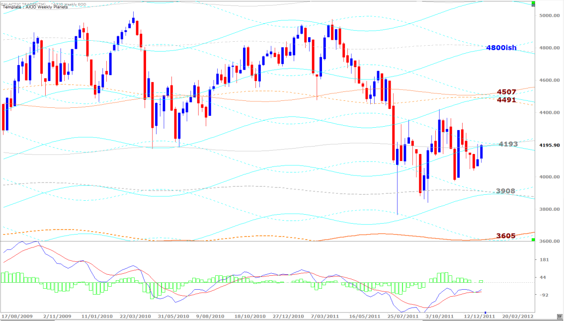
Auntie's Weekly Planets chart (ASX200) is above. This Neptune line, currently doubly enforced by Saturn, is a long-range level which the old bat has to overcome for the Bulls to have any real hope of an ongoing rally.
Markets open the coming week with a Third Quarter Moon - the halfway point between the statistically negative Full Moon and positive New Moon.
Markets open the coming week with a Third Quarter Moon - the halfway point between the statistically negative Full Moon and positive New Moon.
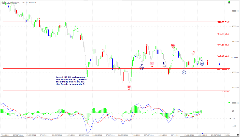
One would think that with Friday's performance in Europe and on Wall Street, Auntie is facing a red Monday and is unlikely to get above the Neptune hurdle on the AWP chart. And the lunar phase trades recently have been very unreliable in terms of their long-term statistical norm, so there's no guarantee there'll be a 3Q-NM rally.
There is, however, some short-term support for that from the fast MACD and its histogram, both of which are higher than their readings 8 days ago when Price was earlier stalled at this level.
If there is a rally, it could come under threat later in the week and not just because of the approaching New Moon. The major astrological aspects of the coming week are the Sun squaring first Saturn and then, next weekend, Jupiter.
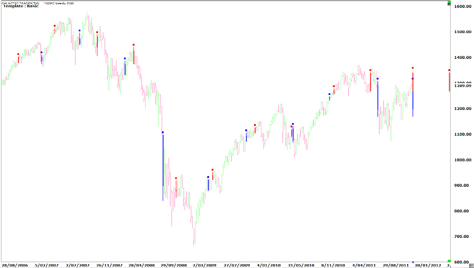
Above is a weekly chart of Pollyanna, the SP500, showing the impact these aspects have had on the index in the past. The squares to Saturn are the red bars with a dot on top and the blue ones are the Jupiter aspects.
We can see a slight tendency to rise when the Sun square Jupiter comes first, but a tendency to fall when the Sun squares Saturn before it makes the aspect to Jupiter. In the coming week we get both of them within a few days of each other - and it's a repeat of the aspect which was present at the August plunge, in the same order of Saturn first, Jupiter second.
Okay, that's it. I've given you some specific and previously unknown information about how to make long-range and intermediate trades on the FTSE ... and used some of the techniques from the book to help guide you in using those targets to make profits with a high degree of safety and confidence.
It's something I'd like all of you to learn from the book, simply because they provide more certainty for larger moves than befuddling our poor brains with the daily diet of verbal dysentery that ultimately leads to a lot of mistakes and to the dreaded analysis paralysis.
Safe trading - RA
(Disclaimer: This article is not advice or a recommendation to trade stocks; it is merely educational material.)
